Project Name: Hetbandhu
Project Location: Ahmedabad, Gujarat, India
Architectural Group: Architects at Work
Principal Architect/Designer: Ar.Shweta Pandya, Ar.Krishna Patel
Client: Mr. Rohit Patel
Project Completion Year: 2019
Total Area: 18000 sq. ft.
Built-Up Area: 9800 sq. ft.
Project Type: Residential
Image Courtesy/Copyright: PURVI PATEL
Text: Maitri Gandhi
VESTIBULE:
At the entry itself, one would be welcomed by Ganesha Wooden mural with brass lotus petals upon that brings positivity; to add on, flooring has been designed to exaggerate the space.
DRAWING ROOM:
The interior for the drawing room is done with simplicity as a concept. The canvas hand painted fish as associated with generating positive energy as per Feng Shui and to flow with it, the free-flowing fish pattern element behind sofas designed from RCC, wood, and steel. The muted fabric sofa which adds stark to the space provided with large openings that overlook the ground and draw the outdoor into the house through designed jalis which lends balance to the room.
DINING AREA:
Offset from living and drawing room, is the double height dining area having customized eight-seater dining table which is most dramatic space of the entire house where horizontality meets verticality through wood and steel staircase with uniquely designed treads adding detail to space.
The pooja area is an elliptical shape carved with handcrafted kutch mirror work and to bring the feel of the traditional mandir, numerous bells have been hanged upon ceiling that chimes and giving essence to it. The intricately carved wooden door accompanied with colored glass and bells hanged upon giving traditional look is standing out of the frame.
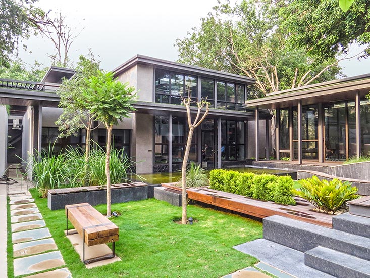
The embossed 3D horse painting that gives strength and adds sparks to dining space in the upper level that add on to the grandeur. While sitting upon the table one has the view towards the courtyard, which is been leaded by inlayed lotus motifs flooring towards the hand-painted floral wall standing elegantly.
As one moves from outer living spaces towards the bedroom we tried to make a subtle shift in ambiance. There are two bedrooms on the ground floor and three bedrooms on the first floor each with attached dressing and toilet. At ground floor bedroom is been approached through common spaces which have white wall and filler slab at the ceiling. The first-floor passage is designed with sophisticated manner connecting to bedrooms and home theatre with glass railing where each bedroom exudes a distinct personality.
BEDROOMS:

Starting with elder son’s bedroom here predominant color is grey-this was preferred as per occupants’ choice with wooden log designed bed; fabric and steel backrest designed in an abstract manner with Italian marble cladded upon the wall. To breakdown, this monochromatic scheme specially designed caricature by the artist is been implemented on wardrobe with unique shutter style. Sprocket wheels on one wall giving the complete rustic look to the room and triangular sofa where the concept is taken from bed back and fulfilling the demand.
While the second room is simple and elegantly designed as per clients taste with white MDF backdrop contrasted with inclined wooden and fabric backrest to the bed with hidden storage, on the other hand, suspended MS plate for TV in front of the window making free space for a moment adding a special feature to it. The third bedroom designed sophisticatedly with no extra element. A delicately designed motif with wood and deco finish upon forming arresting backdrop to the bed, the TV wall is been designed with black deco finish storage merging with the TV unit.
In stark contrast, the rest of the bedroom has a neutral color scheme with each bed designed in a modern way and considering the comfort level, in combination with dark shade veneers upon furniture. The design of the toilet has been conceptualized around the courtyard to bring a lot of sunlight and to have unique bathing experience lighter shade stone has been used upon.
In all AW wanted to maintain the character of the house giving equal importance to the each and every detail, which we didn’t want to repeat and making home lively with all new interior concepts.


