
Project Name: KMYF, Bangalore
Architectural Group: Cadence Architects
Principal Architect: Smaran Mallesh, Narendra Pirgal, Vikram Rajashekhar
Design Team: Thanikaivel Selvaraj, Ashwanth Birla, Gowtham Acharya, Nirali Ashra
Site Area: 2400 sq. ft.
Built-Up Area: 9700 sq. ft.
Completion Date: August 2016
Image Courtesy: Sergio Ghetti & Cadence

The context in that sense was atypical of a generic urban setting. The design stance was therefore to make a sensitive intervention within the context, taking the building as a muted backdrop to the existing scenario with the temple as the main protagonist.
With a challenging brief of a sensitive program for a hospital, it is crucial to understand the end-user who comprises of patients that grapple with emotional angst from the minute they step into the building premises. Conventional hospitals emanate a sense of sterility and are often intimidating.
Hence, the principle idea was to create a building facade that is soft and dynamic, and feels light materialistically. It visually engages the patient before they step into the building almost distracting them from the function inside.

The wards have been stacked vertically to accommodate the thirty beds to ensure maximum space utilization. The building is detached from the ground to enable congregational and waiting spaces for the people. The ground floor also houses all the administration services.

The services of the building are relegated to the rear and the terrace of the building is conceived as the cafeteria. Light is used as a dominant material to design the interior spaces. The softness is achieved through the use and treatment of all materials in a way that they all melt into one cohesive whole based on the detailing.

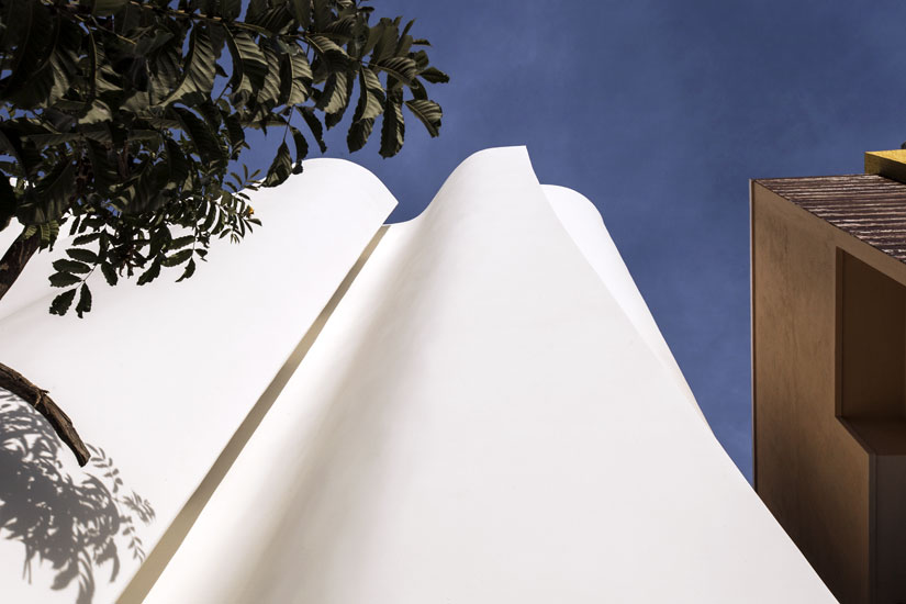
Given that the façade faces the west, the problem of the harsh sunlight hitting the building has been tackled by designing a blank white wall that would reflect maximum heat. Conventional windows have been replaced with shaded slit openings that are tucked in between undulations in the surface.

The building façade is formulated by surfaces built out of brick that have a bellowing quality about them; the sensual quality of the undulations dematerializes the brick surface and renders an ephemeral feel to the building. The building skin is used as a filter to create light that is ethereal, rendering a soothing feel to the wards and the patients using them. The slivers between the bellowing shells allow light to permeate into the building only to create a spatial and visual feel that is as divine as the temple outside.

Owing to a tight site and a range of services to accommodate on the ground floor, a strategy to use syncopated metal pipes that form part of the façade and mask the services. The profile of the pipes in plan also lead a visitor into the building. The bottom half of the building is finished in a way to contrast with the hovering façade.

The façade is finished in white stucco, serving to be the perfect backdrop to the intricately detailed colorful shrine. The idea is to make the peels of the façade seem light and endow a sense of them billowing in the wind, and therefore lightness is a key effect that was intended to be achieved.

This also dematerializes the heavy concrete and brick that has been used to construct it. Given that this is for an NGO, cost and maintenance was a concern, we have used locally available materials such as granites and less expensive materials such as kota as well.


