
Project Name: NGK Technologies
Location: Gurugram, Haryana – India
Typology: Office Space
Architectural Group: NCUBE Design
Designer: Debora Emert
Consultants: Shruti Khatri, Lalit Pandey
Client: NGK Technologies
Project Completion: 2016
Built-Up Area: 3568 Sq.ft.
Image Courtesy: Nakul Jain


NCUBE’s (Formerly known as Nelson India) involvement with NGK dates to 2016, as they began to consider modulating their workplace to align with their growing business and changing work culture. With the transforming global workspace ethos, it is imperative for design to transform and incorporate the various factors. NGK went through a similar movement and chose to imbibe an open layout – designed as per the organization’s vision and beliefs.
The design interventions undertaken in this workplace delineate a spatial ethos inspired by Zen principles that form the roots of the organization’s cultural beliefs and vision.
The texture of exposed bricks painted white, not only serves as a backdrop and a light atmosphere for interaction, but also induces a sense of peace. Corresponding to the walls, the furniture is chosen to be in shades of white or grey.

The entire office setup is linear, with a strong visual axis in the layout. It makes the office setup look ordered. Space imbibes clarity and focuses on segregation of space and movement. By utilizing the existing columns, the layout incorporates a sense of separation between stations. Thus, each station feels central within the office setup and impart stability to the user’s operations.

A warehouse effect is created by exposing the ducts to add a sense of dynamism. A strong play of textures generates ‘the warehouse aesthetic’ with exposed brick walls and ducts. With the ceiling and flooring in shades of blanched grey with a tint of brown, there is a sense of earthiness that tones down the light coming from the glass screens. Glass facades brighten the space up by letting natural light in as well as widening vision to the expanding skyline.

High ceilings contribute to enhancing the space further while generating a prompt feeling of openness to the otherwise small space.
While the high ceilings, glass façade, and white interiors open the space up – giving employees a sense of freedom and transparency, the two defining planes mellow the reflectivity in the environment to impart a sense of stability and a formal attitude.

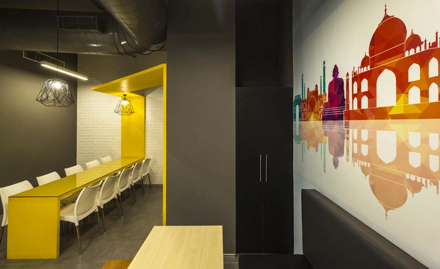
The whole space has a muted ambiance, but to break away from monotony, warm lights and light timber table tops have been used to add a sense of energy. An element of yellow in the cafeteria zone and a wall graffiti add a sense of play, combining the horizontal and vertical plane. They add to a sense of recognition and thus, contribute to team building efforts in designated areas.

While maintaining the idea of a clean setup, the brief called for some contrast in the layout. Glass doors for all-white cabins promote transparency in the workspace and ease of interaction across the hierarchy.

Acknowledging Osada San’s vision for the new space, NCUBE has developed a layout that maximizes space in the 5,000 sq.ft. floor plate. It reflects an understanding of the dynamics of the MNC and strongly advocates Japanese ethics.

About NCUBE:
 Formerly known as NELSON India (an affiliate of Nelson US), NCUBE Design is a pioneer in providing corporate interior Design and Build solutions to major corporations across the nation. With 13+ years of experience currently, NCUBE has spread across 7 locations in India and offer an integrated platform to serve diverse client needs from a single platform.


