
Project Name: Planet Kids, Bengaluru
Typology: Institutional
Architectural Group: Cadence Architects
Principal Architect: Smaran Mallesh, Naren Pirgal, Vikram Rajashekar
Design Team: Sangeeta Patrick, Chaitra Koshy, Gowtham Acharya, Harish Kumar
Site Area: 3200 Sq ft
Built-Up Area: 10500 Sq ft
Image Courtesy: Anand Jaju


The overall design intent articulates the program in a playful manner from a child’s perspective and is conceived as a conglomeration of myriad child fantasies. In order to create spatial intimacy, an anthropometrically scaled space has been crafted, that is scaled down for children- from railings to niches, all of them have been designed to not be overpowering.
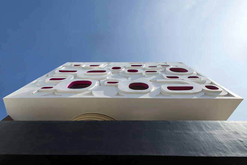
These elements include letters coalescing to form the elevation in the facade, to tiny nooks and corners to children to hide in, to little peepholes in every door and multiple other experiences.

The intention of using various shapes has been to create a graphic space, where each space would become a pedagogical tool. The colors and shapes facilitate the creation of a playful atmosphere, thereby promoting interaction and engagement.

Each program requirement has been seen as an opportunity to create a distinct world for the child. The reception is conceived as a portal to the building and designed to be an object in a Black space.
This colorful assemblage of different worlds and experiences is then connected with a staircase and a special void that cuts through the building in section.

An overall attempt has been made to mimic the idea of the ‘architectural promenade’ in a novel manner, where different spaces unravel along the path of the staircase. The staircase is designed as a sculptural element through a void.
The sculptural void also enables visual and special interaction between the different levels while enhancing the perception of a larger space.

Within the site context and location, the façade was intended to be a billboard in some sense, like a sign. Hence, typography has been used so that the children can relate to it. The entire building has been conceived as a child’s fantasy, flying letters become windows, giant candy shaped objects become rooms, circular openings resembling those on a ship, railings that look like fences in a zoo, and even a playful entrance that is like a mouth of a giant etc.

The fabrication of the distinct elements coming together as a whole, enable the creation of a new identity in the residential neighborhood.

Green is a color that has been used to bring in vibrancy to space, while compensating for the lack of a natural, green environment, making metaphorical references to zoos and forests- all part of a child’s visual vocabulary. Pink is used in contrast to create a calming atmosphere in the otherwise charged environment.

A collage of patterns, colors and materials is crafted; Ferro-concrete is used for the construction of the letters, MS for the patterned bubble grills, Striated paint strips for the library, Kota and vitrified tiles have been used for the interior floors, flexi ply and gypsum for the furniture and ceiling etc.

To facilitate the construction of the non-orthogonal forms and shapes, a non-rectilinear structural grid has been optimized along with the use of ferro-concrete in the facade to sculpt the varied shapes.


[author][author_image]http://www.howarchitectworks.com/wp-content/uploads/2018/07/Cadence-Architects-Bengaluru-logo.png[/author_image] [author_info]Cadence Architects was started as a collaborative architecture practice by architects Narendra Pirgal (B.Arch, R.V.C.E.), Vikram Rajashekar (B.Arch, R.V.C.E.) and Smaran Mallesh (B.Arch, R.V.C.E., M.Arch, Ohio State University, USA) in the year 2005.[/author_info] [/author]


