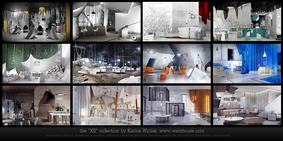
The “XII” Collection by Karina Wiciak, Poland
The collection “XII” consist of 12 thematic interior designs, together with furniture and fittings, which in each part is interconnected, not only in terms of style, but also by name. Each subsequent design was created within one month, and the entire collection was take one year to create.
Here, visualization is to constitute more than a design, which is thrown away after implementation of the interior design, but mainly an image, which has a deeper meaning and can function individually.
These are not interiors made to a specific order, but designs based on the author’s fantasy and his fascinations of various sorts. It is possible to order a specific interior design in the form of adaptation of the selected part of the collection, on the basis of exclusivity.
The author’s assumption is not to create trite, fashionable interiors, but non-standard places, full of symbols and metaphors, at the borderline between architecture and scenography.
Due to their nature, these are mostly commercial interiors, intended for use and reception by a larger group of people. Yet, it is not supposed to be an art gallery, in which art is merely watched, but places in which it could be put into use and to do virtually everything – depending on the purpose and function of the premises.
The author of the collection did not strive to artificially ascribe ideology to random ideas, but rather to make the entire design readable and coherent, and at the same time to design every item specifically for the given interior.
“PTASZARNIA” (1st part in the collection “XII”)

“Ptaszarnia” (aviary) is not only an interior design, but a combination of design and art.
The author’s assumption was not to create trite, fashionable interiors, but non-standard places, full of symbols and metaphors, at the borderline between architecture and performance.
Due to their nature, these are mostly commercial interiors, intended for use and reception by a larger group of people. Yet, it was not supposed to be an art gallery, in which art is merely watched, but places in which it could be put into use and to do virtually everything – depending on the purpose and function of the premises.
The author of the collection did not strive to artificially ascribe ideology to random ideas, but rather to make the entire design readable and coherent, and at the same time to design every item specifically for the given interior.

The project “Ptaszarnia” includes the armchair “Ptaszek” and the hanging lamp “Ptaszyna” .
The “Ptaszyna” lamp (which in Polish means ”nestling”) look luxurious at the first glance. Gold and black finishing, as well as shape resembling a reverse crown are to symbolize splendour and wealth. But do not let the appearance deceive you, as this lamp has a second nature. Dripping golden icicles have irregular and awkward shape, which makes the lamp a little scary as well. “Ptaszyna” is a supplement to the “Ptaszarnia” project (which in Polish means “aviary”), and the entire idea is based on the theme of birds.
The “Ptaszek” armchair “ (which in Polish means “birdie”) also looks luxuriously and resembles a bird, but the surprise is the fact that the armchair walks over the floor and the walls, leaving tracks behind it.

Thanks to this, the entire enterer comes to live and assumes slightly grotesque appearance, which reflects the author’s idea on architecture and design in general – which we should treat with greater sense of humour.
“UBOJNIA” (2nd part in the collection “XII”)

“Ubojnia” (slaughterhouse) is not only an interior design, but a combination of design and art.
The author’s assumption was not to create trite, fashionable interiors, but non-standard places, full of symbols and metaphors, at the borderline between architecture and scenography or even performance (in the future).
Due to their nature, these are mostly commercial interiors, intended for use and reception by a larger group of people. Yet, it was not supposed to be an art gallery, in which art is merely watched, but places in which it could be put into use and to do virtually everything – depending on the purpose and function of the premises.

The author of the collection did not strive to artificially ascribe ideology to random ideas, but rather to make the entire design readable and coherent, and at the same time to design every item specifically for the given interior.
At first glance, “Ubojnia” shows a motif of hatching, a sketch which not only the main element of decoration, but also visually changes the scale of the room. People who stay in such an interior may get an impression that they are shrunk, or at least that they are in a fabulous and unreal world.
Yet, the very name of the establishment suggest another, hidden message (in Polish “ubojnia” means “slaughterhouse”). Seemingly-paper armchairs called “Szkic” (in Polish “szkic” means ”sketch”) are suspended on meat hooks or tied to chains, which is supposed to symbolize omnipresent restrictions to creativity in art and design. The very word “ubojnia” may indicate killing of talent and creation, though not necessarily by third parties (as these are not shown in the images), but by the artists and designers themselves.
Yet, it is but one of numerous interpretations of symbols which anyone can understand in their own way, or not interpret at all. After all, it is a commercial interior, so any possible, more or less blatant, ideology can be treated with a pinch of salt, and in the case of this specific interior, even with slightly “noir” sense of humour.

The “Ubojnia” design includes armchair “Szkic” (which in Polish means “Sketch”),
a suspended stool “Szkicownik” (which in Polish means “sketchbook”),
a chandelier “Papierek” (which in Polish means “piece of paper”),
A sphere-shaped, suspended and floor lamp “Kula” (which in Polish means “sphere”),
a smaller suspended lamp and wall lamp “Haczyk” (which in Polish means “hook”).
“MASARNIA” (3rd part in the collection “XII”)

At first glance, “Masarnia” looks like a sweet, winter-Christmas picture, or like a modern, elegant interior. Glass furniture and lamps give the impression of wealth, and the classic, red colour is a decorative feature in the minimalistic, white interior.
Yet, on closer inspection it turns out that the interior is more macabre than sweet.
It turns out that the white furniture and lamps are rescaled elements of the human body, and the red elements of the design imitate blood. As you can see, the glass decorations with sharp edges are also not random, as, according to the author’s conception, they were used to make these gruesome furniture.
The design symbolically shows objective treatment of the human body, e.g. when creating the so-called consumer goods (including design).

The author believes that if people can destroy or exploit the nature, than perhaps it is worth to think what would happen in the roles were reversed? Yet, this design is neither an ecological manifesto, nor an attempt to preach. „Masarnia” (like the previous design “Slaughterhouse”) is merely a pretext for reflection and another concept of an interior with a slight (perhaps black) sense of humour.

The “Masarnia” (which in Polish means “butchery”) design includes glass table “Szklany” (which in Polish means “glass”),
a chandelier “Szklany”,
a glass hocker “Szklany”,
a suspended lamp “But” (which in Polish means “shoe”),
a chandelier “Korpus” ( which in Polish means “human trunk”),
a armchair “Korpus”.
“WAROWNIA” (4th part in the collection “XII”)

The “Warownia” is not only a restaurant and a club, but also a magical place, where the décor imparts an intriguing, slightly fairy-tale atmosphere.
Usually, each interior has its history, but his place came into existence in a special manner…
In the “Warownia”, one can see primarily white, shiny walls, among which a beautiful and young girls lives. Shutting herself off from the truth of the external world, she resembles a princess locked away in a tower.
Yet life is no bed of roses, and any artificial, idealized world which we, people (as well as this princess), construct for ourselves never stands the test of time.

Therefore, the white, shiny walls which symbolize impeccably clean appearances, ultimately break off dirty, cracked walls, showing the other, dark side of life. This is when the bright, clean interior turns into a dirty, dark dungeon.
What happens to the “princess” afterwards? Everyone can invent their own story.

Yet, this is not a fairy tale which should be told to the customers of the restaurant, but rather a short (albeit made-up) history of the interior, which should be treated with a slight pinch of salt.
“SZKLARNIA” (5th part in the collection “XII”)

“Szklarnia” is the fifth part of the collection called “XII”, entirely designed by Karina Wiciak.
Usually, restaurant owners care about not having their establishment demolished, but here someone has made quite a mess…
At first glance, the “Szklarnia” looks like a demolished establishment. A place where the customers are not too well-behaved and release their gangster inclinations… But this is no “Fight Club”, but another interior in which the author’s fantasy is a pretext for creating an unusual decoration.
The décor itself is supposed to surprise, especially as the word “demolition” hardly befits an elegant restaurant. Elegant white and shiny glass also contrast with damaged walls, cracked floor and scattered stones.

This design is an attempt to depart from the concept of a classic, elegant restaurant.
The author’s goal was to introduce a pinch of humour, or even vulgarity, into the world of snooty art and political correctness.
This does not mean that the author encourages anyone to violence, but rather to get some distance from one’s own image, particularly at a place as elegant as a restaurant.

So it turns out that even in a regular restaurant design it is possible to smuggle one’s world view and create a place for people who also seek intellectual sensations.
“STOLARNIA” (6th part in the collection “XII”)

Stolarnia” (in Polish – Carpenter’s Shop) was inspired by the landscapes of the Bory Tucholskie National Park, near which the author lives and works.
According to the author, a forest is a unique carpenter’s shop, where the nature uses wood and plants to create the most beautiful forms.Thus, the forest in itself is a perfect, designer work and no man can invent anything more perfect than the nature itself. So why not transfer that which is perfect and which has already been invented by nature into an interior?
Pine trees, the most typical of the Tuchola forests, were used in the restaurant as a modern decoration, yet in a metal form. This is also a way of, and a pretext for, emphasizing the structural elements and fittings.

Hills, which are also typical of the Tuchola forests, inspired creation of an undulating, wooden floor.Some plants (intentionally) cannot bear pressure and bend, giving life to the floor. As everybody knows, not everything in a forest is arranged perfectly, thus this symbolic disorder, which conforms to the natural trends in nature.
One could say that pylons do not occur in forests, to say nothing of national parks. Yet, for many years they have been an inherent element of rural landscapes, and thus have integrated and almost blurred with the surrounding nature. And since the pylons are situated near forests, they can also function (as decoration) in a less natural space, which a restaurant is.

The “Stolarnia” design includes also a design of chair and table impaled on nails, entitled “Szpilka” (Polish for pin), as well as a chair and a hocker “Ambona” (which means raised hide), inspired by the shape of a popular forest raised hide.
“PALARNIA” (7th part in the collection “XII”)

Palarnia (in Polish means “Smoking room” ) is a place decorated primarily by smoke. It adds mystery to the interiors by making them more theatrical. It can also act as an effective screen for people looking for intimacy in the billows of white puff. The smoke can be compared to night clouds cast over the sky, mysterious fog illuminated with the moonlight or can be simply seen as cigarette smoke by those who miss the times when smoking in pubs was not prohibited… Free interpretations abound here and the setting may provide screenplay writers with food for thought.

The second characteristic motive, in addition to the smoke, is a motive of riveted sheet metal which is used in the production of furnace.
It is true that the walls do not resemble the shape of the furnace, but the idea of using rivets is ideologically connected with the motive of smoke.

The “Palarnia” design includes also chair “Flaga” (which in Polish means “flag”), a hanging lamp “Nit” (rivet) and table “Nitowany” (riveted).
“SZWALNIA” (8th part in the collection “XII”)

“Szwalnia” (which in Polish means “sewing room”) is a combination of modern design, minimalism, as well as a pinch of magic and fable-like atmosphere. This design was inspired by everything related to tailoring, but applied in a more symbolic manner.

The background of the interior consists of white walls and floors “sewn” with black thread. Instead of typical partition walls, there are large surfaces of hanging cloth, which also form an untypical facing of the stairs. Enlarged tailor pins serve as characteristic ornaments, while also forming a balustrade, chair backrests, or hocker legs.
Small poufs, which resemble pincushions, also refer to the motif of a sewing room.

This distinctive interior is supplemented by lamps in the shape of curtain tassels, as well as wall ornaments in the form of knobs from an old sewing machine.
The “Szwalnia” design includes lamps called “chwost” (in Polish “tassel”), a “zszyty” table (in Polish “sewn”), as well as a chair, a hocker and a puff called “nabity” (in Polish “spiked”).
“PAPIERNIA” (9th part in the collection “XII”)

“Papiernia” (which in Polish means “paper mill”) is an elegant restaurant in a slightly industrial style, the leading element of which is ordinary cardboard , treated with tongue in cheek.
Some people may associate cardboard with junk or lash-up, but in this case it was used to create an exclusive, elegant restaurant. Most walls and the floor are made of this very material. Also the furniture are adapted the nature of the interior, as they combine traditional wooden legs and backs with cardboard seats and tops. In a regular restaurant, the guests would most likely take insult if told to eat dinner in cardboard, but in “Papiernia” the vip-rooms are located in simple, large boxes.

Ornaments in this interior include scraps of transparent adhesive tape on the walls, as well as metal details, such as stairs in the form of EUR-exchange pallets, or partitions which separate the tables, made of enlarged razor blades. Actually, these razorblades were used to cut holes in the walls… at least, that is how it should appear 🙂

The interior is supplemented by lamps, small cardboard ones over the tables, and large ones resembling traditional, old-school chandeliers.
The “Papiernia” design includes also designs of lamps and furniture:
– small ceiling lamp “kartonik” (which in Polish means “small cardboard box”)
– a large chandelier “kartonowy” (which in Polish means “cardboard”)
– a table “kartonowy”
“PRACOWNIA” (10th part in the collection “XII”)

“Pracownia” is the tenth project of the collection “XII”, designed entirely by Karina Wiciak.
The restaurant is called “Pracownia” (which in Polish means “workshop”), because it was designed as a light pastiche of a painter’s studio. The most characteristic features of the interior are colourful blobs, because almost the entire interior of the “Papiernia” has been splashed with paint, from floor through furniture to the ceiling. It was not designed to be youth interior in the pop-art style, but to be modern, elegant restaurant. That is why, beyond the blots, the white and silver metal finish dominates.

To the topic of painting studio, some other design elements have been matched.
Structural columns resemble enlarged paint brushes.
Glass, pendant lamps and table tops have a shape of palette.
A bucket (of course a paint bucket) is present both in the design of tables, chairs and pendant lamps. Brush ends (sticking out of a bucket placed in the table) are used instead of the usual candles or table lamps.

Since the whole interior is designed like a painter’s studio, also the toilets cannot deviate from the topic. Therefore, the design of compact toilet bowl and sink also uses a form of bucket, and the counter top and mirror are mounted on a large easel.
Interior design of the “Pracownia” includes:
-dining table “wiadrostół” (which in Polish means ‘bucket table’)
-white chair with coloured blots “zachlapany” (which in Polish means ‘splashed’)
-floor lamp with colourful dots “zachlapana” (which in Polish means ‘splashed’)
-white hoker chair in a form of a cut bucket “wiadrohokerr” (which in Polish means ‘bucket hoker chai’)
-white pendant lamp in the form of a bucket “wiadrolampa” (which in Polish means ‘bucket lamp’)
-high bar table with glass top “paleta” (which in Polish means ‘palette’)
-white armchair in the form of a cut bucket “wiadrofotel” (which in Polish means ‘bucket armchair’)
-white pouf in the form of a bucket “wiadropufa” (which in Polish means ‘bucket pouf’)
-glass, pendant lamp “paleta” (which in Polish means ‘palette’)
-compact toilet bowl “wiadromiska” (which in Polish means ‘bucket bowl’)
-inset sink “wiadroumywalka” (which in Polish means ‘bucket sink’)
“POCZEKALNIA” (11th part in the collection “XII”)

“Poczekalnia” is the eleventh project of the collection “XII”, designed entirely by Karina Wiciak.
“Poczekalnia” (which in Polish means “Waiting Room”) is a restaurant inspired by the prison.
Not only the interior but also the name of the restaurant itself is a kind of metaphor, because the prison itself can be euphemistically described as a kind of waiting room. The entire interior was done in white and black pop-art colours, with the addition of orange fabric – as a characteristic element of clothing of convicts in prison.

Prison bars, and even the cells in which paradoxically the VIP rooms are located, are the main element of the design. The bar is also behind the prison bars, and the toilets are designed in the form of iron cages, enclosed with orange curtains and glass wall (outside).

Hanging lamps in the shape of handcuffs and a chandelier in the form of a key chain are another prison motives. Interiors are complemented by tables and chairs with motive of bars and a big key lock.
The project of “Poczekalnia” also includes:
-Table “kraty” (which in Polish means “prison bars”)
-Chair “kraty” (which in Polish means “prison bars”)
-Hooker chair “kraty” (which in Polish means “prison bars”)
-Hanging lamp “kajdanki” (which in Polish means “handcuffs”)
-Chandelier “klucze” (which in Polish means “keys”)
“SZMACIARNIA” (12th part in the collection “XII”)

“Szmaciarnia” is the twelfth project of the collection “XII”, entirely designed by Karina Wiciak.
“Szmaciarnia” (which in Polish means “rag-house”) is the latest project from the collection of “XII”.
This is the interior gently referring to the “Szwalnia” project, but the architecture of interior is created by the cloth alone, and actually by the patchwork.

If you can create the interior with the old board (“Papiernia”), or with scribbled paper sheets (“Ubojnia”), you can also use old cloths, clumsily stitched with thick thread.
After all, “Szmaciarnia” is not a tribute to the idea of recycling, but a proof that the elegant interior may be created not just with popular glass or metal.

The rough texture of the fabric does not need to be associated with cheapness and mediocrity, and the possibilities of its application are still endless.
The “Szmaciarnia” project also includes:
– armchair “zszyty” (which in Polish means “stitched”)
– hooker chair “zszyty”
– chandelier “szmatka” (which in Polish means “cloth”)
– sink “zszyta”
– toilet bowl “zszyta”
View more works of KARINA WICIAK.